

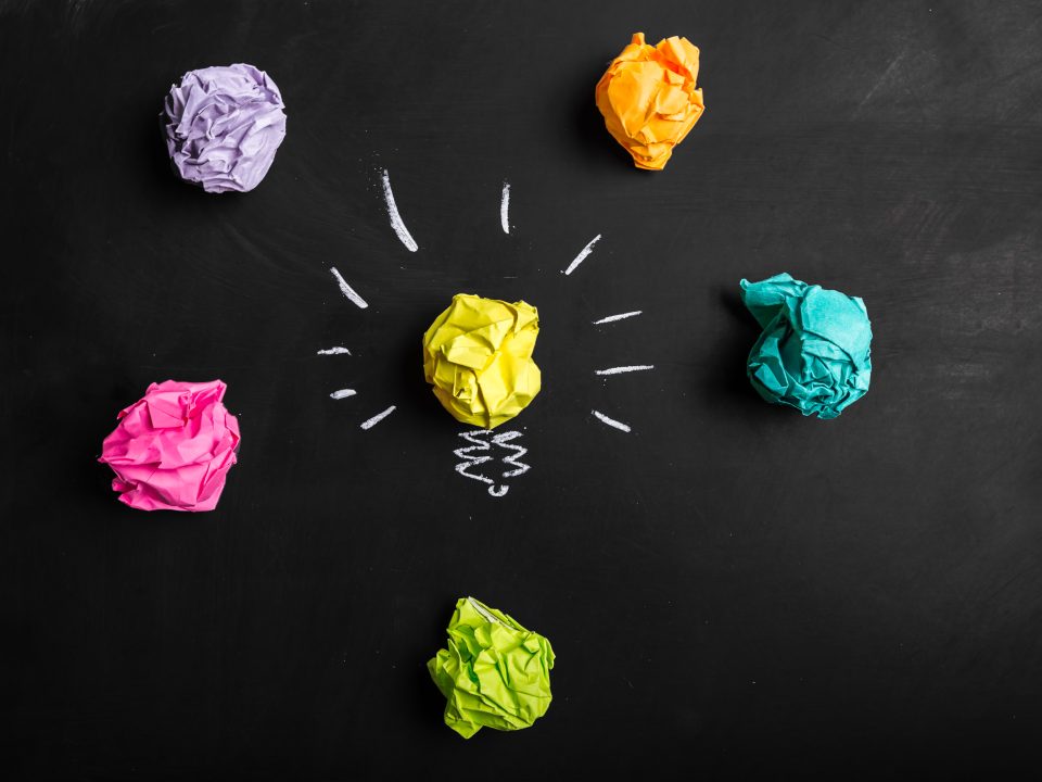
Standing Out: What Makes a Brand Memorable in a Crowded Marketplace?
March 10, 2026
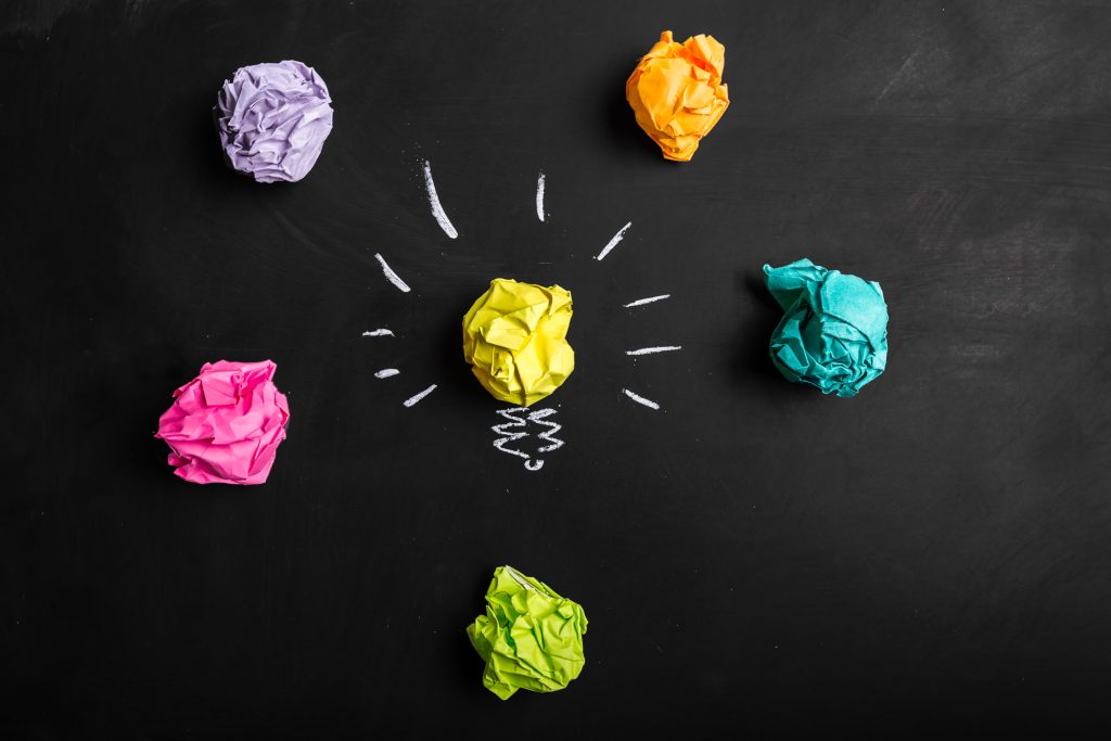
Rebranding Done Right: When It’s Time to Refresh Your Identity
March 18, 2026
Have you ever wondered why so many fast-food chains use the color red, or why banks almost always rely on blue? It isn’t a coincidence. In the world of marketing, color is practically a language of its own. Research shows that people make a subconscious judgment about a product within the first 90 seconds of viewing it, and up to 90% of that assessment is based on color alone.
At Sumner Group, we love helping businesses uncover the “why” behind what works. To help you better understand how your visual identity impacts your audience, we’ve put together this warm and informative Q&A on the psychology of color in branding.
Q: What exactly is color psychology in marketing?
A: Color psychology is the study of how colors influence human emotions, perceptions, and buying behaviors.
In a marketing context, it is the strategic use of specific hues to shape how consumers feel about your business. Color acts as a visual shortcut, communicating your brand’s personality before a customer ever reads a single word of your copy. When used effectively, the right palette can increase brand recognition, foster trust, and even drive sales.
Q: How do specific colors influence consumer behavior?
A: Different colors trigger deeply rooted psychological and cultural associations.
While personal preferences play a role, broad trends exist in color psychology that marketers rely on every day:
- Blue: Evokes feelings of trust, security, and calmness. This is why it is the go-to color for financial institutions, healthcare providers, and tech companies.
- Red: Creates a sense of urgency, excitement, and passion. It actually stimulates the body and raises the heart rate, making it perfect for clearance sales and food brands.
- Yellow: Associated with optimism, warmth, and clarity. It grabs attention quickly, making it a great choice for window displays and cheerful, youthful brands.
- Green: Strongly tied to nature, health, and tranquility. Brands focused on sustainability or wellness frequently use green to signal eco-friendliness.
Q: Can a simple color change really impact my website’s success?
A: Yes! Strategically using contrasting colors can significantly increase conversion rates.
In web design, there is a psychological principle known as the Von Restorff Effect (or the Isolation Effect). It states that when multiple similar objects are present, the one that differs from the rest is most likely to be remembered. If your website is mostly blue and white, using a vibrant orange for your “Buy Now” or “Contact Us” button will naturally draw the user’s eye and increase the likelihood of a click.
Q: How should a business choose the right colors for its brand?
A: You must choose colors that authentically align with your brand’s unique personality and the expectations of your target audience.
Don’t just pick your personal favorite color. Instead, ask yourself: What is the primary emotion I want my customers to feel? If you are a high-end luxury brand, sleek blacks and metallics might be appropriate. If you are a playful children’s brand, bright primary colors are a better fit.
Developing a cohesive brand strategy is the most critical first step. Once you define your core values, you can translate those traits into a visual identity.
Q: Can I update my brand colors if they feel outdated?
A: Absolutely. Rebranding is a natural part of a successful company’s evolution.
If your current palette no longer reflects your services or target audience, it may be time for an update. Investing in professional creative design can breathe new life into your business, ensuring your visual identity matches the quality of the work you do.
Choosing the right colors is a blend of art and science. If you’re ready to discover the perfect palette for your brand, the dedicated team at Sumner Group is here to help you make a lasting, colorful impression. Contact us today!

